Providing capital for underserved communities aspiring to homeownership, Capital Plus Financial tasked Waqa Studios with creating a brand that would appeal principally to their majority-hispanic clients in Texas.

Branding for a specific market segment.
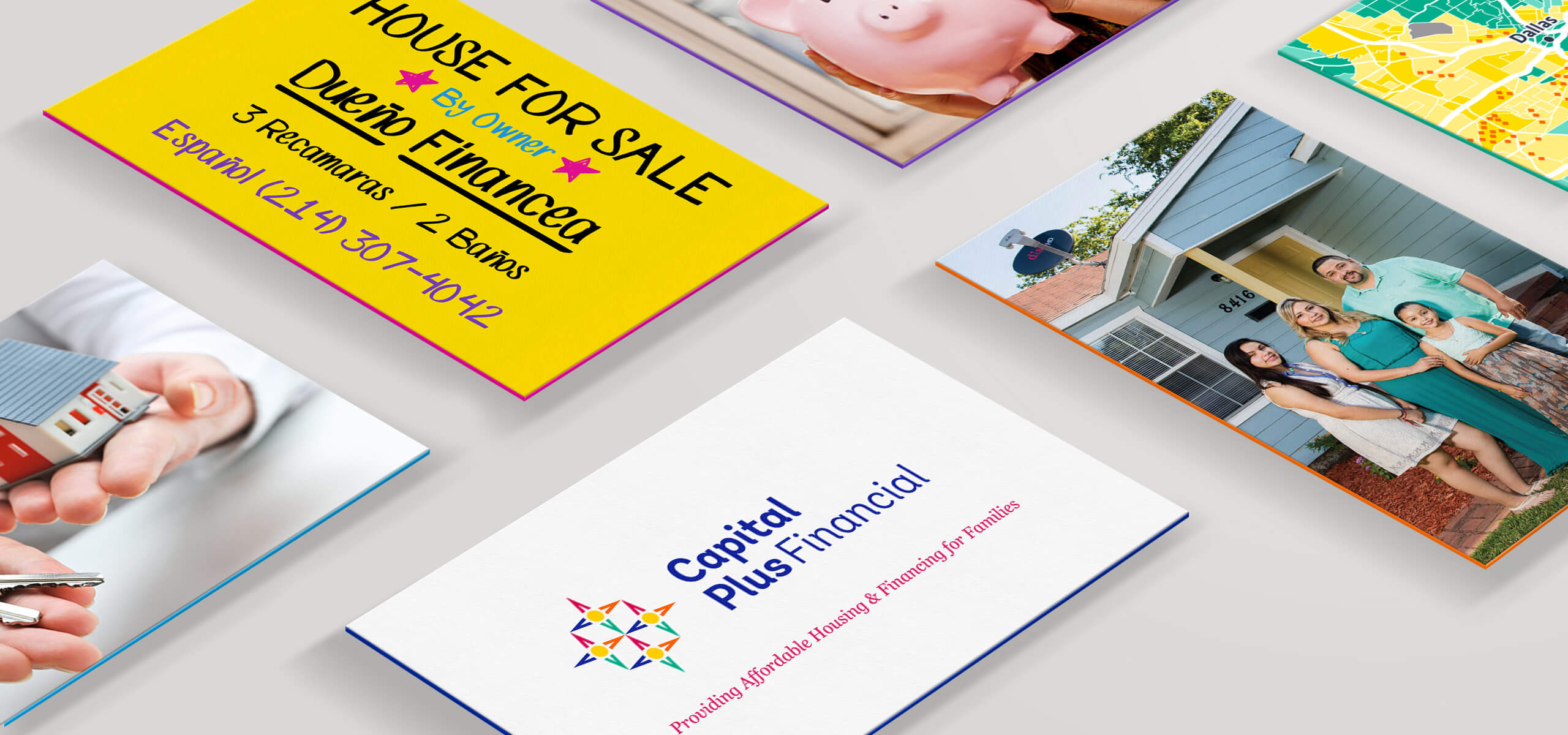
Targeting the hispanic community in southern Texas, who principally have ties with neighboring Mexico, we wanted to develop a bright and attractive color scheme while also maintaining a feeling of the seriousness of a financial entity.


Taking our cue from the bright colors found in Mexican traditional culture, from many regions, we found our bright supporting colors. We settled on a solid blue representing stability and strength for use in the main logo where “Capital Plus Financial” appears and as a primary color throughout the brand.
Bilingual Website Strategy.
This website was developed so that both English and Spanish versions of the content would be available. Switching between languages is quick and easy, and for the website administrator, creating content in both languages is also problem free.
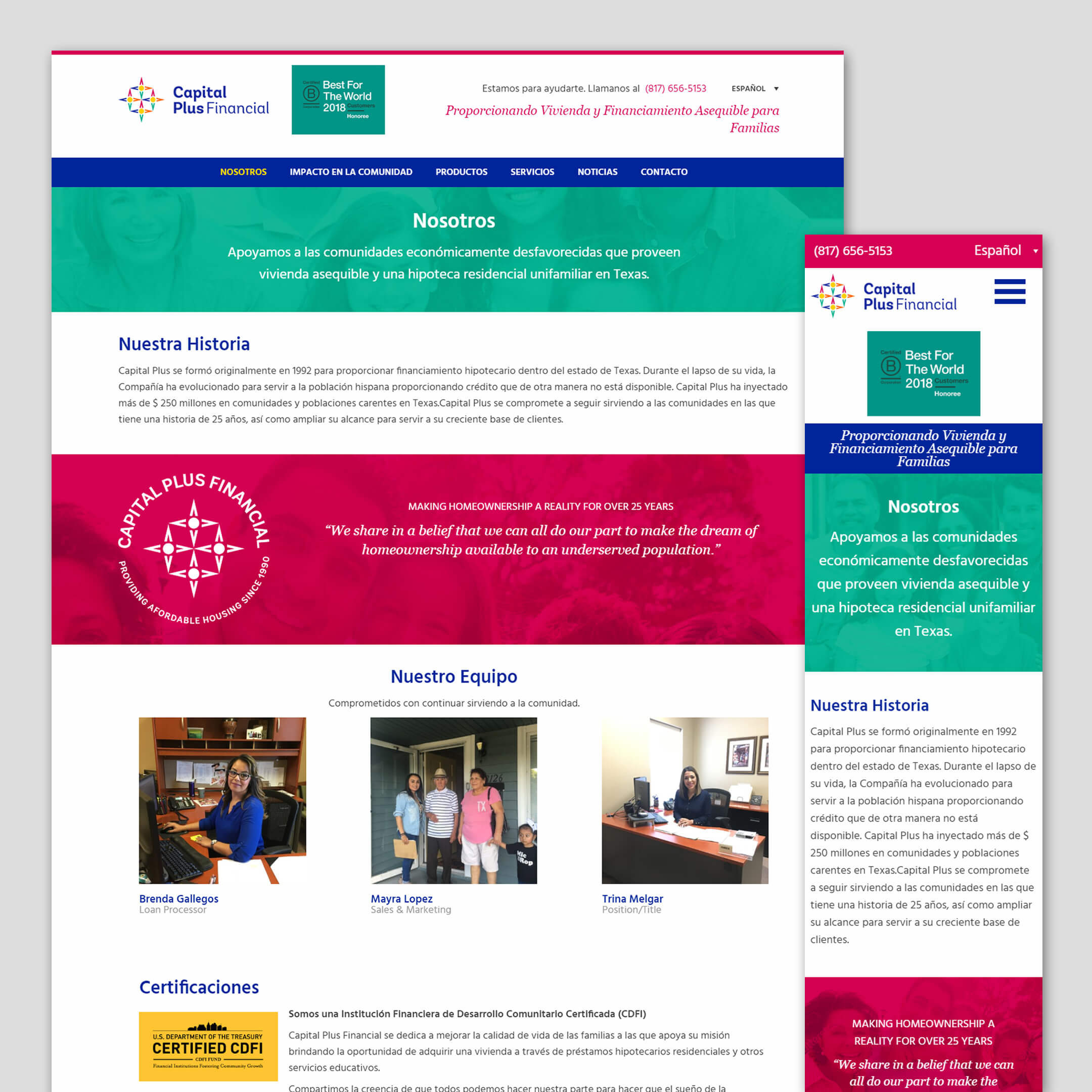
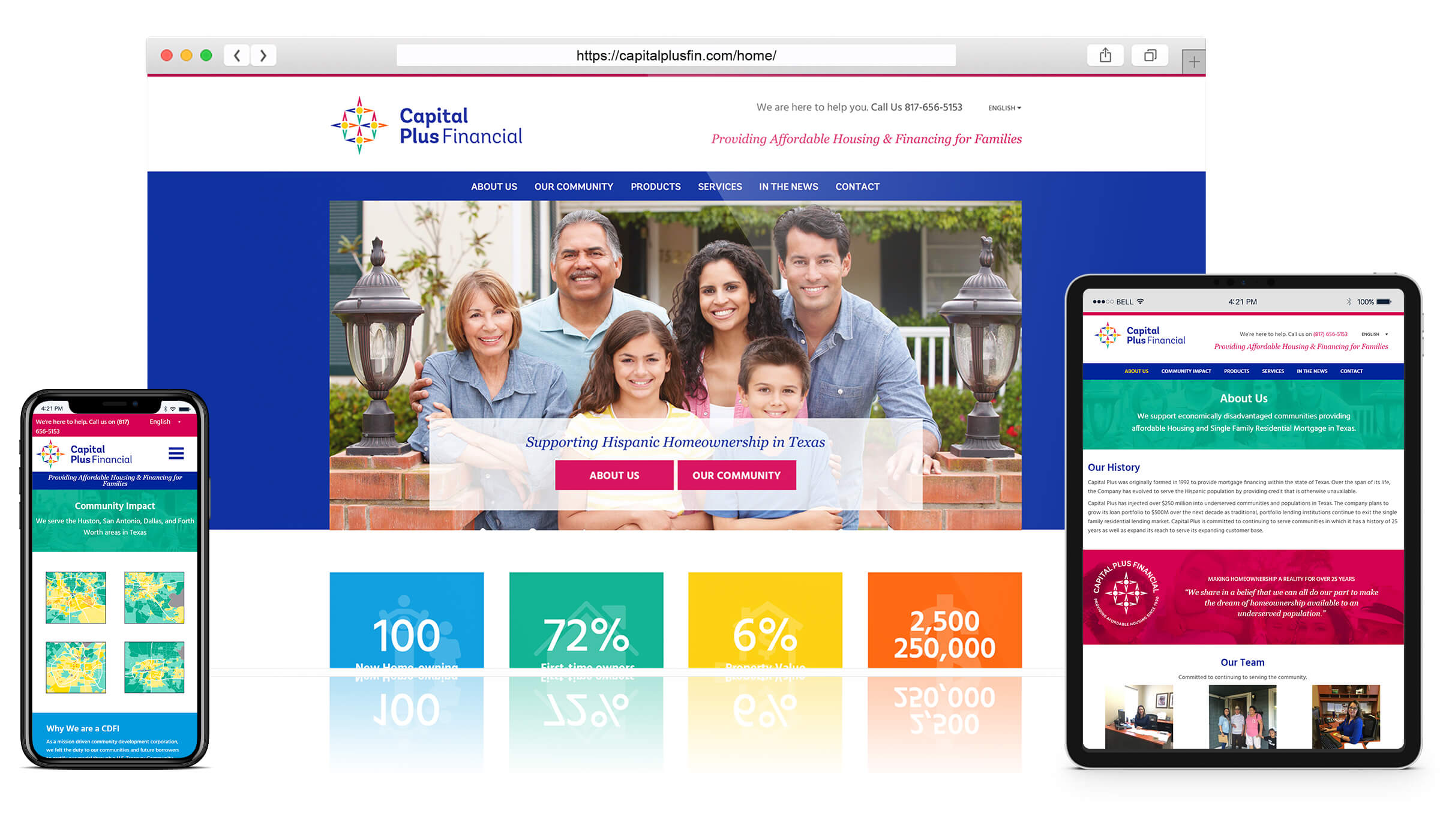
The aim of the website is to provide information to potential homeowners looking to find an affordable mortgage. As such the focus is on explaining what Capital Plus Financial is and does, what services are offered and then directing people to call.

Launch.
The website launched in time for Capital Plus Financial to be awarded the 2018 “Best For The World” for Customers honoree status in which the company was scored within the top 10% of all B Corps.
So far the new website has provided information to thousands of potential loan recipients and has been an excellent source of new enquiries.
Want to read about more projects like this?
If you have a similar project in mind and would like to receive additional case studies not shown online, complete the form below indicating a project type to receive our portfolio PDF.