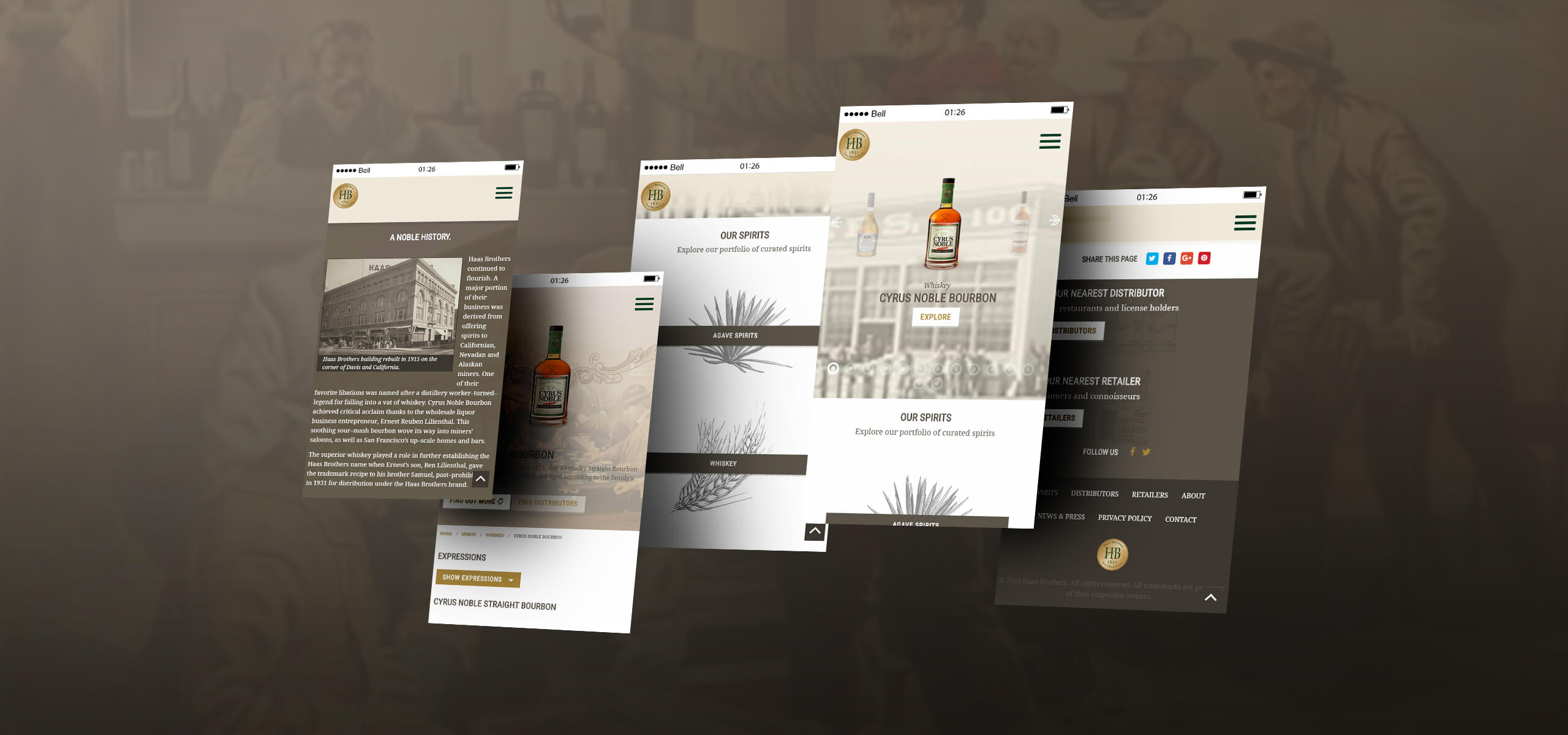
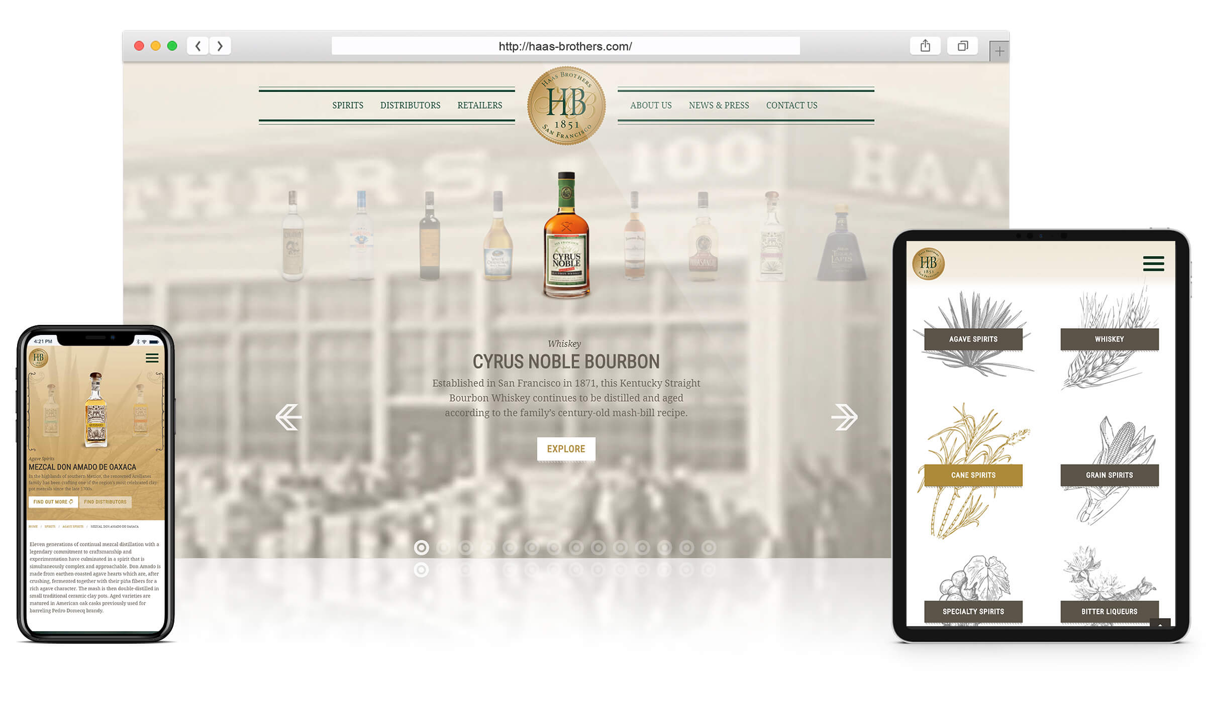
Haas Brothers has been importing and selling spirits in the United States since 1851. They approached Waqa Studios to renew their dated website, to build a new modern responsive website and to design a new visual style for the website that is modern but rustic enough to reflect their history and location.

Website Strategy.
Great care was needed when developing the layouts and structure for Haas Brothers. It was important to identify the types of visitors the website receives and what those visitors will be looking for when they land on website. Components and blocks of information were weighted by priority to define a layout that would achieve the best results for Haas Brothers based on sending visitors to the right information quickly.

Unique Design.
The Haas Brothers website was designed to create a new look that felt like something out of 1850s California or northern Mexico but was also modern and didn’t fall into any tired clichés.
Using desert colors and subtle elements such as the shading under buttons that are reminiscent of the line-art/etching style used in a number of their own brands we achieved a clean functional look that also felt old timey.

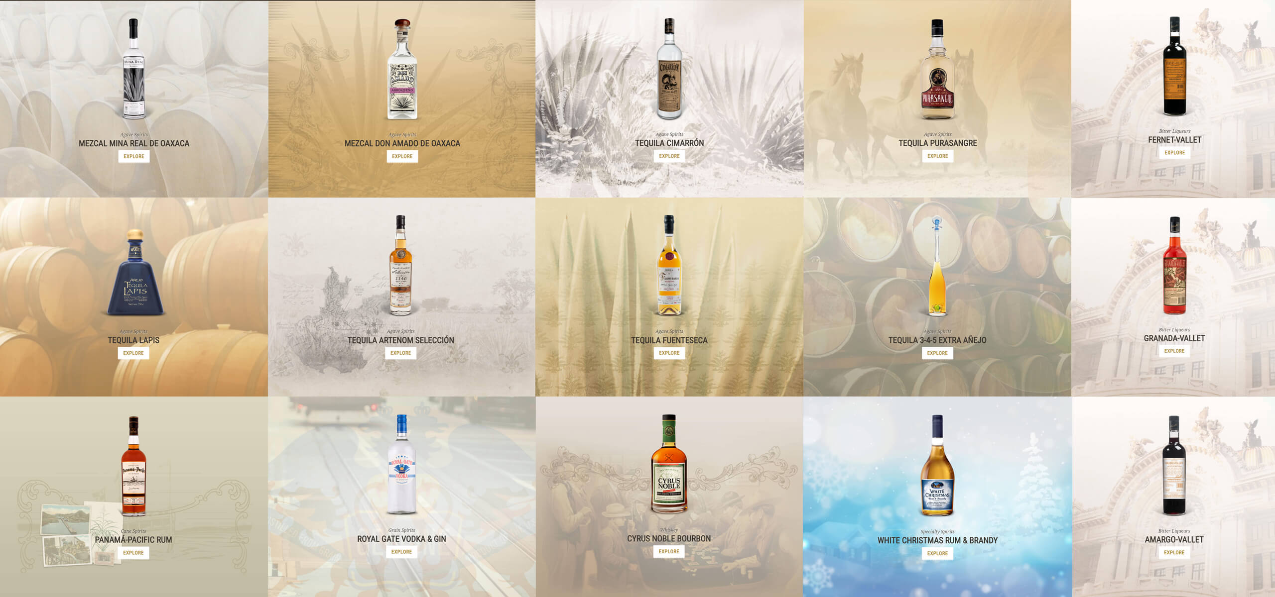
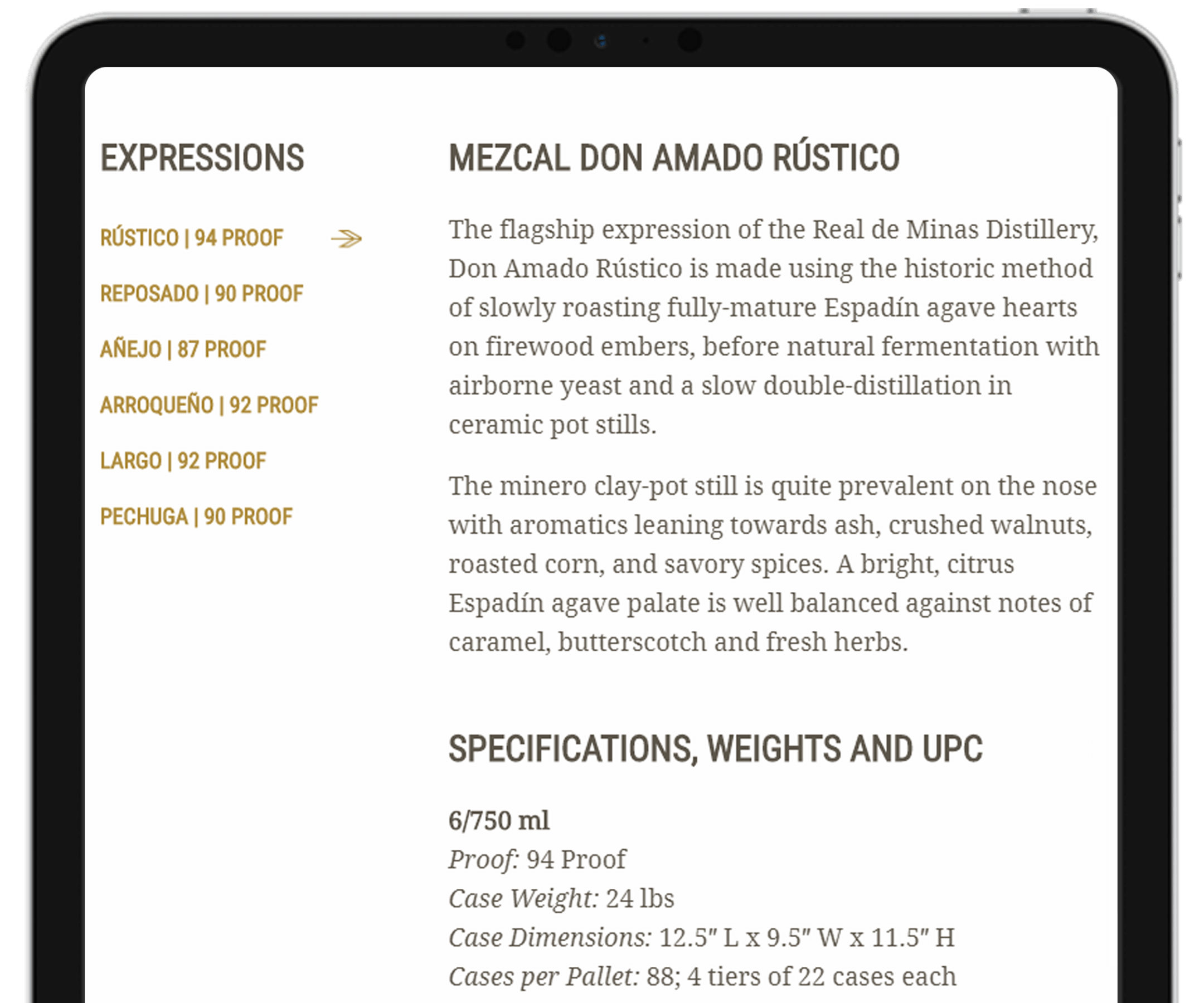
A key feature was for the website to act as a virtual catalog for the different categories of spirits and the numerous products and variations of products within each category. Primarily this information was directed toward distributors and retailers, but it is also useful for end consumers.
Results.
The new website was launched shortly after completion, after a positive response during demonstration to board of directors. Having been so well received, the same layout and strategy was used as the basis for similar spirits-related venture the stakeholders were involved in.

Want to read about more projects like Haas Brothers?
If you have a similar project in mind and would like to receive additional case studies not shown online, complete the form below indicating a project type to receive our portfolio PDF.
