Analysing the problems and defining the goals.

Our client’s niche market is the tens- if not hundreds-of-thousands of non-computerized small 3-star-and-under hotels and hostels across Latin America, though with an initial focus on Peru. While many of these hotel and hostel owners had listed their businesses on the dominant booking platforms (such as Booking.com), few, if any, had a connection between online platforms and internal records. Most on the lower end would keep a paper-based list or agenda detailing future bookings. These would be a mix of walk-in bookings and online bookings that they would then have to write down. They also often lacked a physical means to accept international credit cards from walk-in guests… and backpackers notoriously run out of cash.

The solution was to build an online reservation SaaS system that would function as both an internal system for the hotel and as a platform for potential customers. For hotel owners it would allow them to manage their hotel, room types, room occupancy status and reservations. It would allow them to automatically assign guests to available rooms while having this be reflected immediately in availability status. It would record the guests’ details automatically and make that information instantly available through what they’d consider to be their internal management system. They could still manually add bookings from other platforms and they would also be able to process walk-in credit card payments via an admin interface or by directing guests to open a URL on their mobile device.

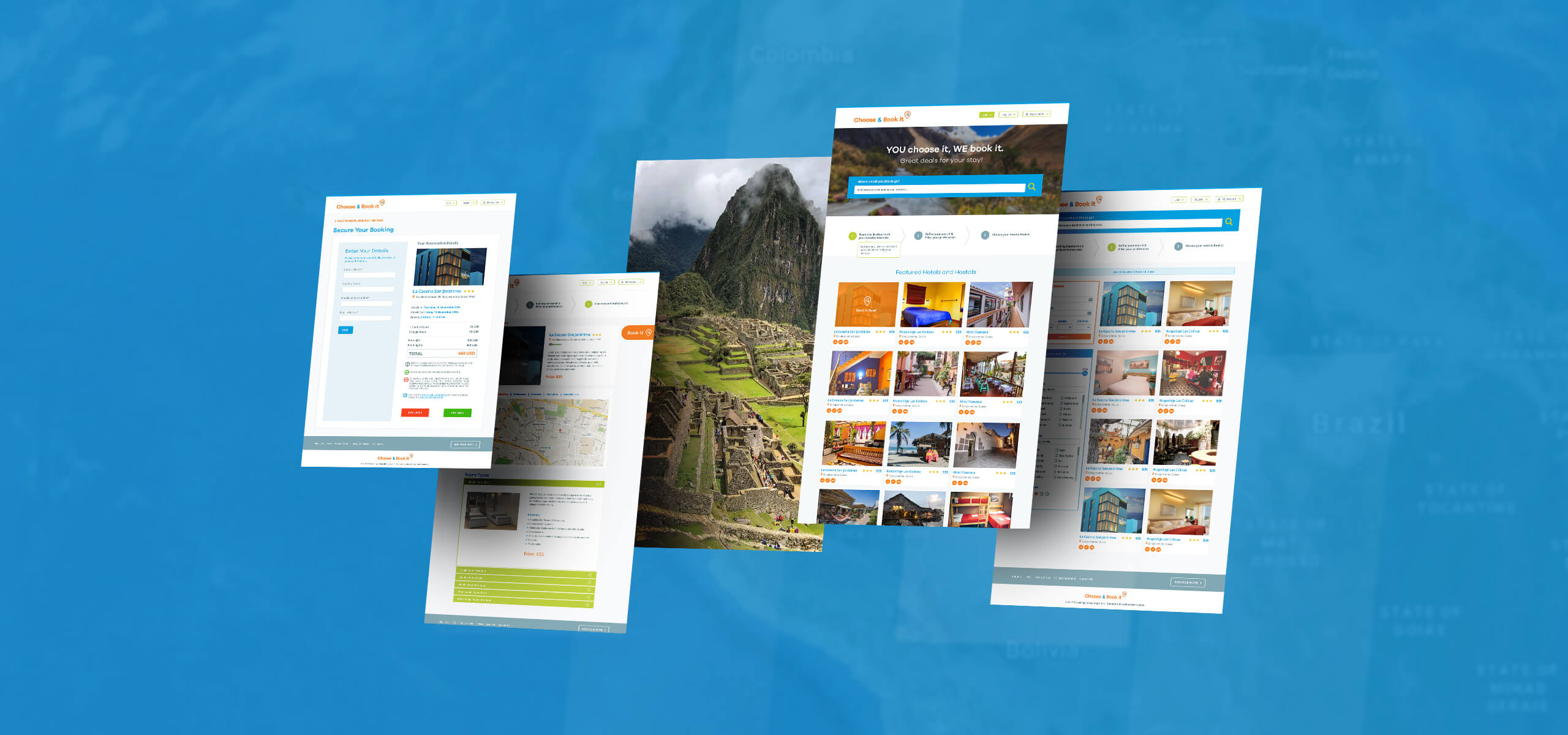
Conversely, for travellers looking for hotels and hostels specifically in the 3-star and under range, they would have an online booking platform featuring only options that are appropriate for their needs, with details specific to this niche. This means rather than listing amenities like room service, we instead show en-suite bathroom availability, or whether rooms face busy streets. With a focus on tourist travel, specific tools that aren’t found on other platforms would be developed to help sort through and filter hotels. This platform would be marketed specifically as a hotel reservation website for backpackers, young people and budget travellers.

For hotel owners, our goal was to provide an internal booking system while also connecting them to an internet booking platform. While typical systems of this type can have complex and confusing interfaces, we had to design a user experience that would not scare away a non-technical user. Information needed to be displayed only when appropriate, with an easy to understand path to completing key functions. Interface elements needed to be designed so that it was clear what they meant and what they did, while overviews of data had to be designed to be easy to consume.


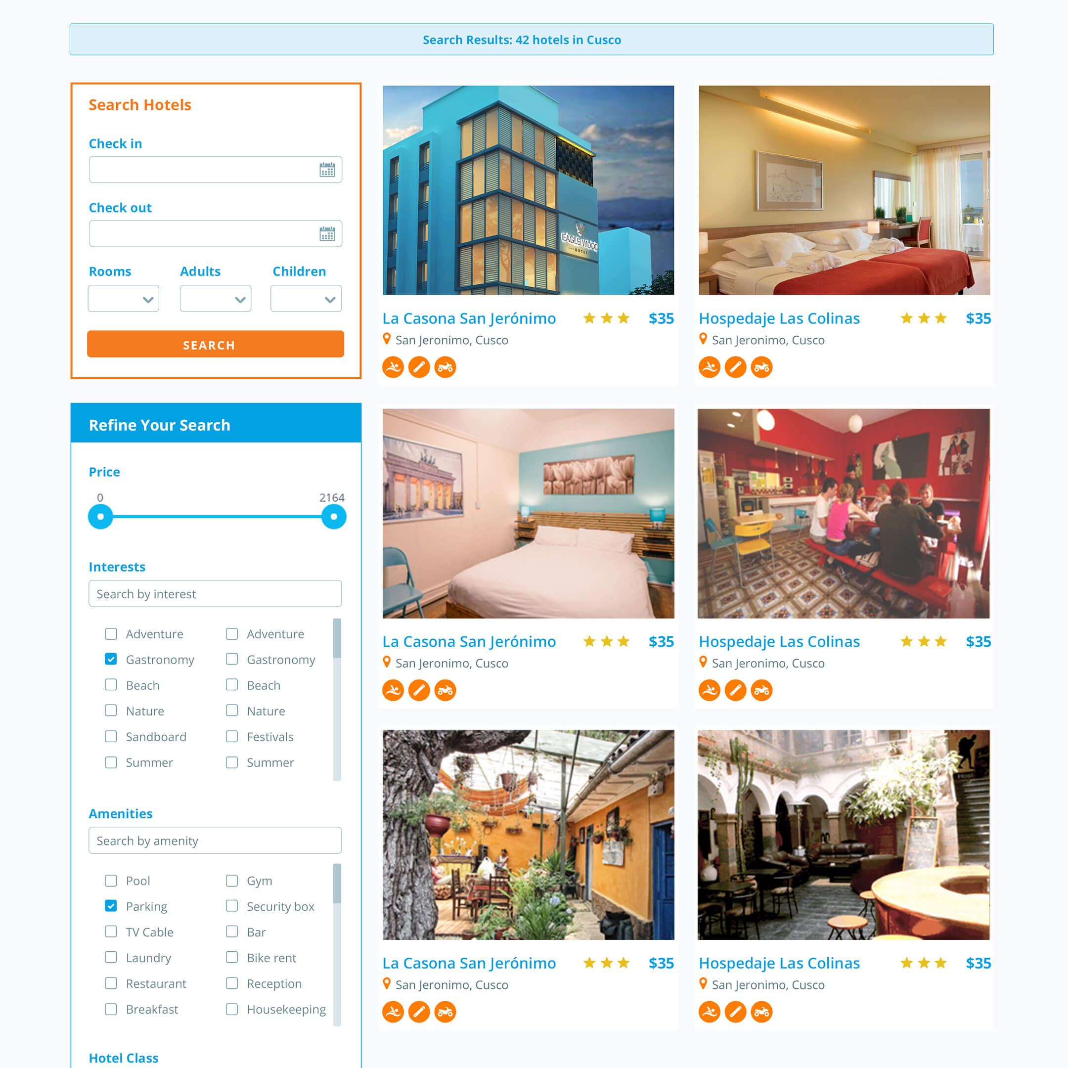
For travellers, our goal was to present information that was relevant to them. From room-share hostels to affordable 3-star hotels, they’d have different filtering tools available than you’d find on many booking platforms, such as the like forgoing a private bathroom if they wanted to reduce costs. There’s even the option to book beds in shared rooms. While the traveller’s interface is more commonly seen and recognizable by all (still, care was taken to make filtering by dates and price as easy as on any other platform) we also introduced a few new tourist-focused ideas.

UI/UX for a hotel owner interface.

Not all hotel owners or front desk staff would be completely comfortable with a complex web interface displaying all the moving parts that a hotel has. We needed to create a user experience that was simple, focused on the task at hand and took them through each process in an orderly way.

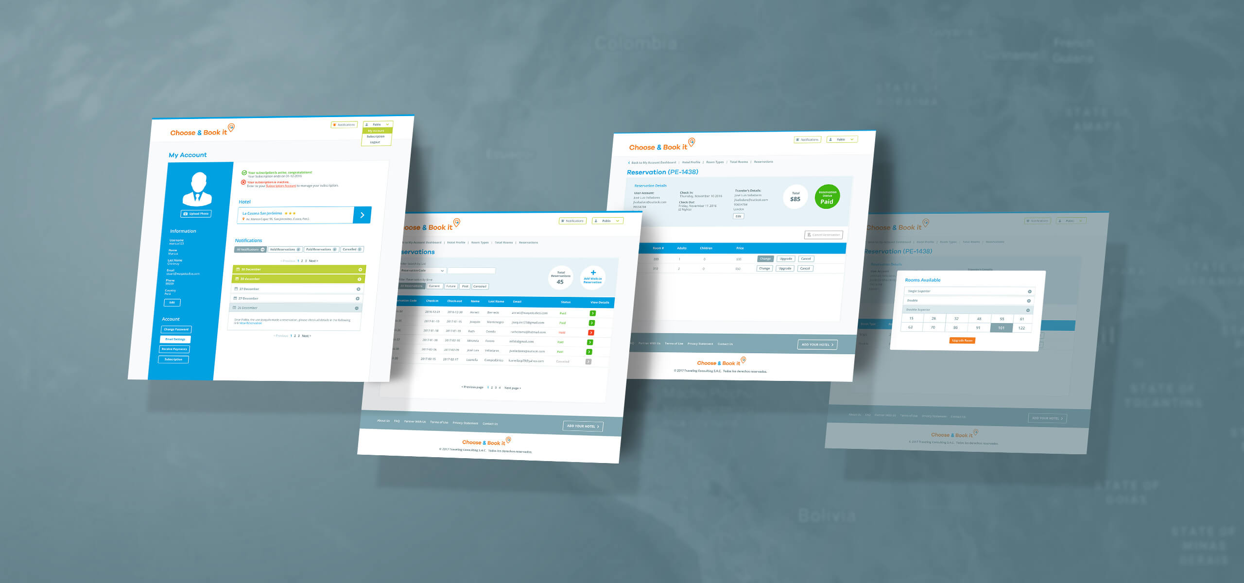
We settled on an experience where a user would click through a series of steps to perform each task or access data. Additional steps would be presented one by one and more detailed information only revealed the deeper the user goes. This lead to an extremely clear, ordered and simplified interface.

At the same time, despite hiding the typically overwhelming complexity you might find on your average “admin panel”, we needed to bring important/urgent information to the forefront.


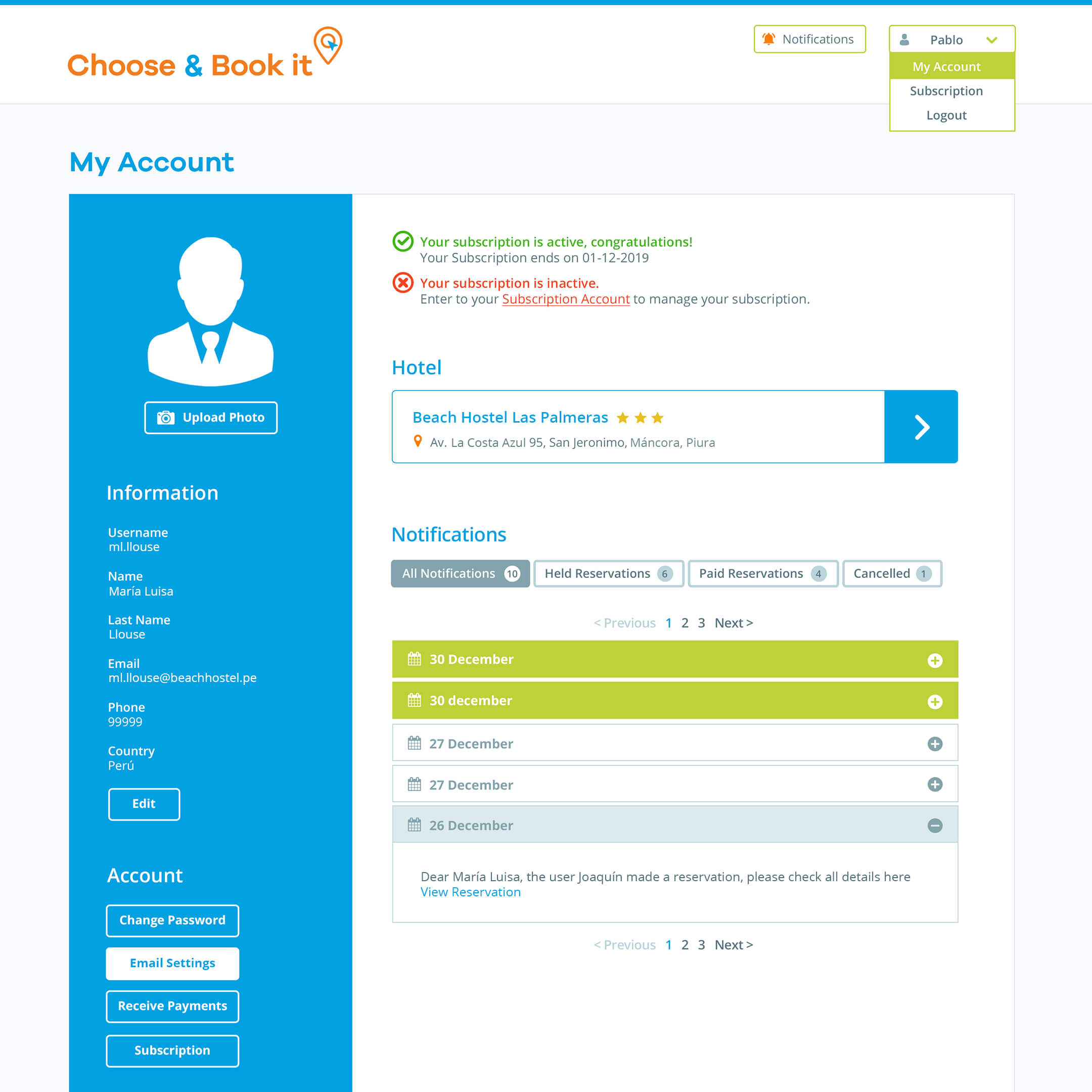
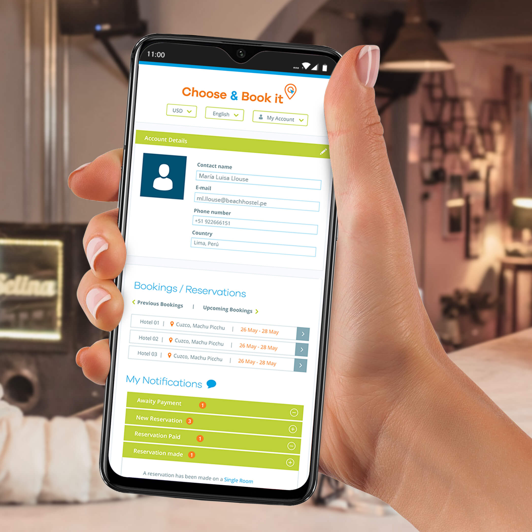
So we paired our click-through approach with a notification system, with notifications displayed both in a bell at the top of every page but also as a significant feature on the main landing page.

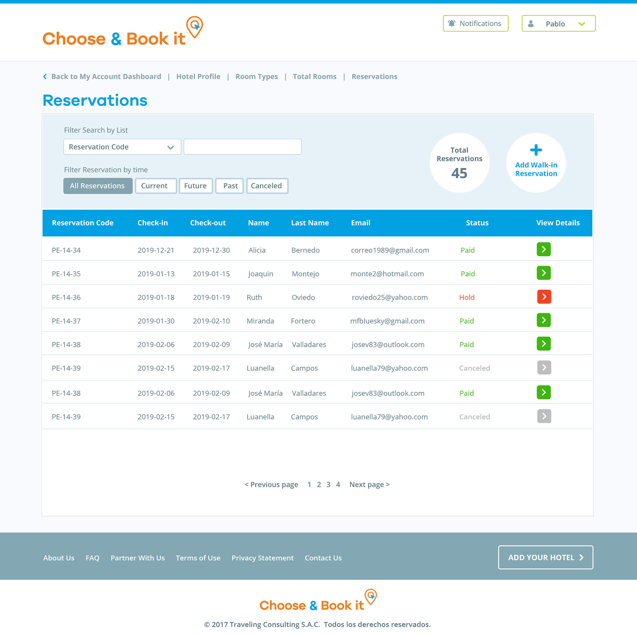
Throughout the more complex parts of the interface, such as this reservations list screen, we would hide unnecessary information behind clicks, displaying only that information that would tell you if you needed to click through or not.

UI/UX for the traveller.

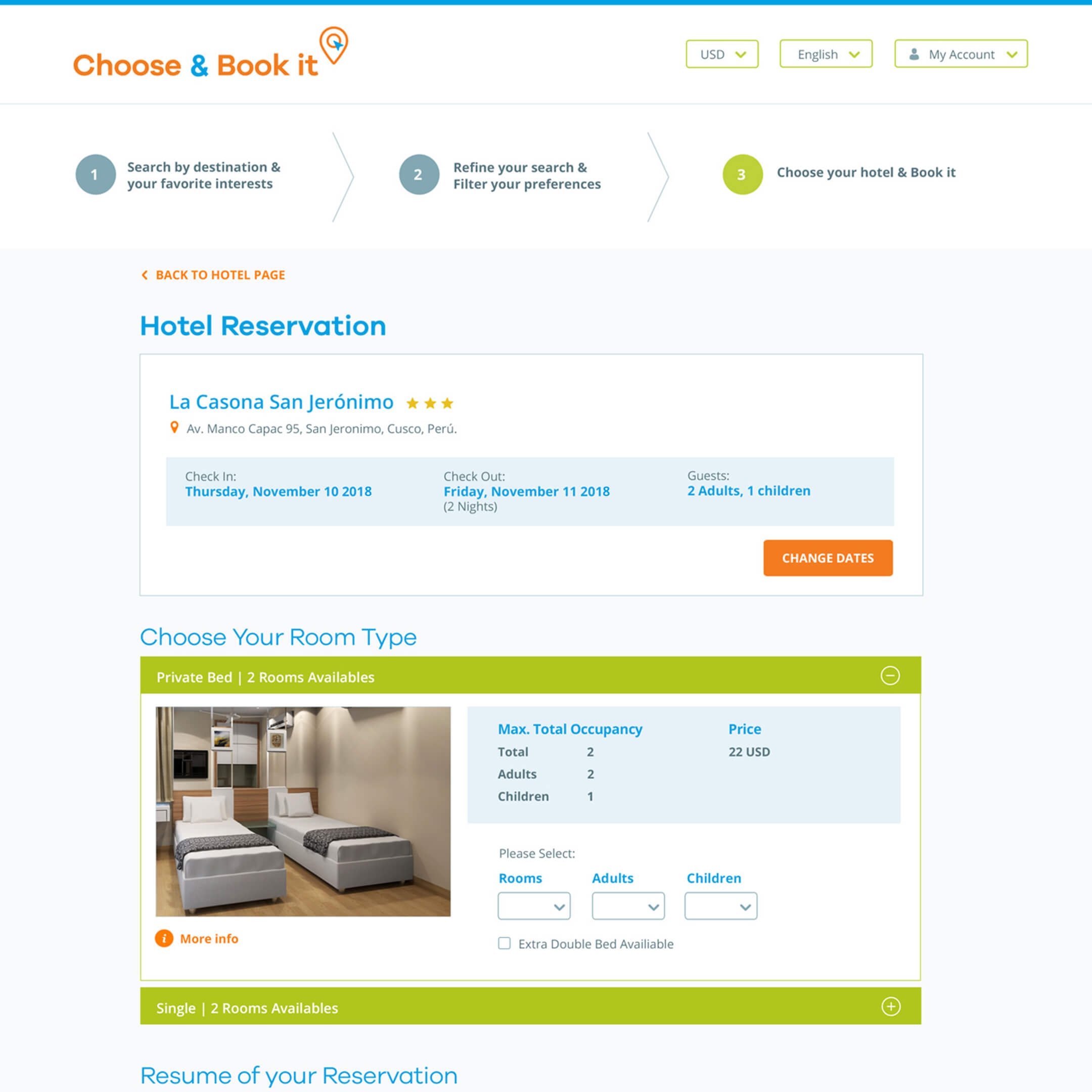
Anyone who has booked a hotel online is familiar with a typical hotel search, filtering and booking process. Ours isn’t particularly different and a traveller will find it instantly recognizable and familiar.

With a focus on tourist travel, including for backpackers, we had the opportunity to add a little bit more to the experience with some innovative ideas.

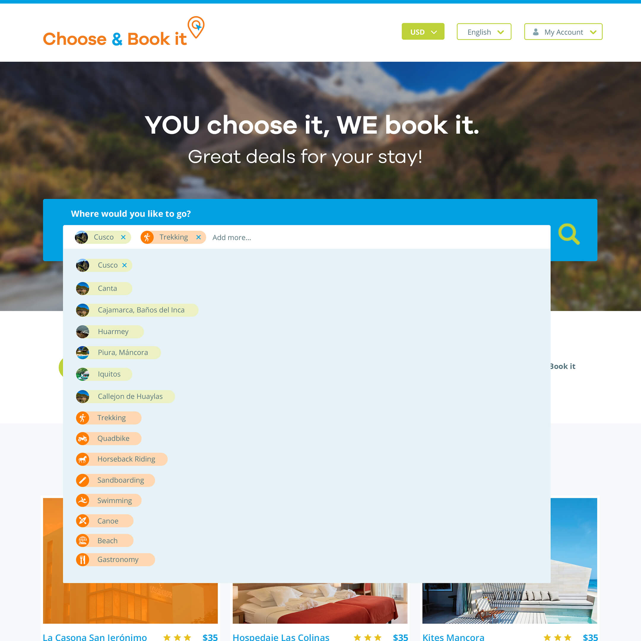
Not only did we pair hotel profiles with particular locations and tourist spots, we also paired them with tourism-related interests.


This allows a tourist to search for a hotel somewhere in a country based on the hotel’s ability to offer, or its proximity to, beaches, trekking routes, water sports, gastronomic attractions, among many other things. A search for just “beach” hotels would list hotels up and down the coast, from which they could then filter by locations. Searching for multiple interests, or interests and cities together, would narrow down options more quickly.

Want to read about more projects like this?

If you have a similar project in mind and would like to receive additional case studies not shown online, complete the form below indicating a project type to receive our portfolio PDF.