When I was at school we had a class called Design and Technology which involved learning lots of useful skills such as architectural drawing (where we learnt to sketch real world three-dimensional objects on paper with angles and lines that made them look realistic) and to design product packaging with the guidelines, tongues and flaps needed for them to be properly glued together.
Pretty fancy stuff for an inner city school in London where I grew up.
We also spent some time looking at interfaces. Physical analogue interfaces, obviously, as this was the early 90s. I liked this a lot, because rather than drawing the corners of rooms, of boxes or of the vanishing points of long corridors we actually had to be creative for the class project we had to complete.
Every kid had to design an interface for a device, any device. It had to make sense, consider all the functionality needed for the device to work and be clear and easy to use. We didn’t know it, but on our own terms we had to each work out the fundamental rules of interface design.
User interfaces generally need to follow common conventions and recognizable patterns so that users intuitively know how to use them. Even if they’ve never seen your application before, they need to have some idea how to interact with it.
We had also been taught about Isotypes (International System Of TYpographic Picture Education), which are a method of showing social, technological, biological and historical connections in pictorial form. The buttons on our interfaces, for example, would make use of symbols.
All the other kids seemed to be coming up with variations of music devices… which were Sony Walkman cassette tape players in that era. Although all the same basic device idea, some kids had interesting variations, from one handed button layouts to buttons that had raised symbols so you could feel each button in the dark. Good ideas.
I didn’t want to do the same as everyone else, but the music player idea did make me think of other types of music player, for example the car radio. I’m not sure where the idea came from as my family didn’t even own a car (London is a lot like New York like that, you can totally survive without a car), but the idea came to me.
What if we incorporate the car radio controls onto the steering wheel? My reasoning was that the user wouldn’t need to take their hands off the wheel to change stations and that they wouldn’t need to look off to the side to look for the right button to press. They could keep their eyes on the road and see the buttons in their peripheral vision, or, they could look at the steering wheel and still see the road in their peripheral vision. Perfect!
I drew out my steering wheel concept, placing buttons too the sides of the center of the steering wheel, next to the horn that still covered the majority of the area.
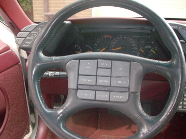
At this time buttons on steering wheels weren’t really something that car makers did. A quick glance at Wikipedia shows that about 20 years earlier the 1974 Lincoln Continental was the first to introduce rocker switches for cruise control on the steering wheel itself, while it wasn’t until 1988 that Pontiac offered a steering wheel option with audio controls like mine. Both of these weren’t cars you’d see in the UK anyway, and I’m not sure if any European manufacturers had been doing this in the years since Pontiac apparently introduced it and when I may have come up with the idea myself. (I say ‘may’ because though I definitely wasn’t a kid interested in cars, maybe I’d seen the idea before).
When it came time to present our ideas and I stood up to show mine it was well received. It was a different and interesting idea, and my explanation for the button layout made sense, which is all the teacher really wanted to get us thinking about.
There was some criticism though, which is why I know that controls on steering wheels were very uncommon at that time, perhaps even generally unheard of on normal small affordable family cars.
When you turn the wheel the buttons move position, turn it a lot and the buttons are upside down.
What if you hit the buttons when making a turn?
Isn’t it going to be distracting for the driver?
They’re always going to be fiddling with the music rather than paying attention to the road.
Some of these criticisms came from the teacher herself. Actually, the fact that the buttons wouldn’t always been in the same place when turning the wheel was what caused me to get just a passing grade on the project rather than an A.
University
Years later in university, I was studying a couple of modules of user interface design as part of my computer science degree. I had long since forgotten I’d studied anything to do with the topic before and really enjoyed the examples of both good and bad interface design examples we were shown in class, as well as the explanations of what makes good interface design and what can and does go wrong. These were both analogue and digital interfaces from big and small companies.
Soon came the time when, as part of the course, we were expected to design an interface for a device following the rules of good interface design. When we were filing out of the lecture hall, someone I knew turned to me and a friend I was with showing us his rough sketch. It was a steering wheel with built-in MP3 player controls and hands-free phone controls.Bluetooth was pretty much just coming onto the scene and audio controls were now available on steering wheels, though I believe only in high-end luxury models. And this was still London. I still didn’t drive.
It was a good idea, I told him. And from some obscure memory I said, “but when you turn the wheel all the buttons are upside down, and if you’re turning a long light corner the buttons aren’t going to be in the right place. He shrugged then obviously wondered if he’d thought his idea through as well as he should have. I don’t know what he eventually handed in.
The Future is Now
Yet more years later, this time halfway around the world, I was buying my second car, which was the first I’d ever bought that was brand new. It wasn’t a fancy car. It was a Kia. But by this time even the cheapest of cars came with a whole bunch of options that would have been considered luxury a decade before. This car had a USB port for MP3s, iPod integration and Bluetooth connectivity. It also had tonnes of controls on the steering wheel. And I didn’t once consider that to be a problem. There was no way to bump them when making a turn. There was no need to be meddling with music when you’re making a turn anyway, you’d do that when you were finished, so I’d never find the buttons upside down when I needed to use them.
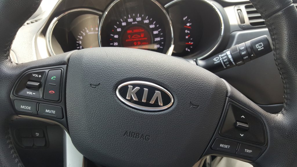
And I used the buttons all the time, because the main controls were a stretched-arm away and I couldn’t identify the buttons by touch alone, so I’d have to look and take my eyes completely off the road.
Audio controls on the steering wheel were a great innovative idea. But as they were with me, they were probably dismissed by a lot of people along the way as either unneeded or just bad interface design.
And I guess that’s the point I’m trying to make with this story, the lesson I’ve learnt about interface design. Don’t be afraid the break the mould. Sure, interfaces need to be intuitive and consistent. But if you need to do something completely new, something that attracts criticism, and you think it will truly be a better experience, perhaps you should ignore the naysayers. You might be breaking new ground and changing the face of a type of interface forever.